EDA — Variation

PSY 410: Data Science for Psychology

Dr. Sara Weston

2026-04-27

What is EDA?

Know your data before you test it

Before you run a single statistical test, you should know your data well enough to predict what the results will look like.

That’s what EDA gives you — no surprises.

Exploratory vs. confirmatory

Exploratory (EDA) Confirmatory
Goal Discover patterns Test hypotheses
Attitude Curiosity Rigor
Questions Open-ended Pre-specified
Output Visualizations, hunches p-values, conclusions

EDA comes first. You can’t test a hypothesis you didn’t notice.

Good EDA means looking before you test

“EDA is an attitude, not a technique.”
— John Tukey

  • Ask questions
  • Answer them by visualizing data
  • Use what you learn to ask new questions
  • Repeat

There is no single “right” way to do EDA. The goal is understanding.

What we’re doing today

Exploring variation — what does a single variable look like?

  • Distribution shape
  • Center and spread
  • Outliers and unusual values
  • Missing data

Tomorrow: covariation — how do variables relate to each other?

Our dataset: Big Five Personality

glimpse(bfi)
Rows: 2,800
Columns: 28
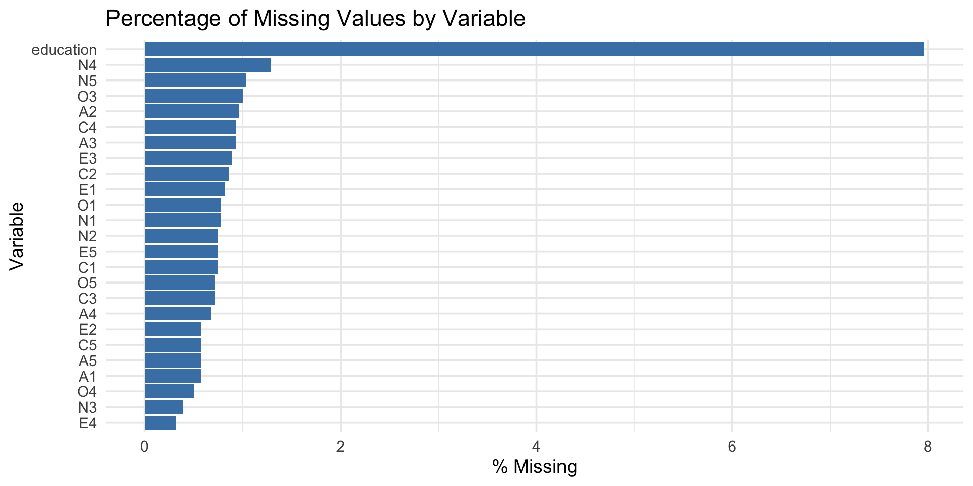
$ A1        <int> 2, 2, 5, 4, 2, 6, 2, 4, 4, 2, 4, 2, 5, 5, 4, 4, 4, 5, 4, 4, …
$ A2        <int> 4, 4, 4, 4, 3, 6, 5, 3, 3, 5, 4, 5, 5, 5, 5, 3, 6, 5, 4, 4, …
$ A3        <int> 3, 5, 5, 6, 3, 5, 5, 1, 6, 6, 5, 5, 5, 5, 2, 6, 6, 5, 5, 6, …
$ A4        <int> 4, 2, 4, 5, 4, 6, 3, 5, 3, 6, 6, 5, 6, 6, 2, 6, 2, 4, 4, 5, …
$ A5        <int> 4, 5, 4, 5, 5, 5, 5, 1, 3, 5, 5, 5, 4, 6, 1, 3, 5, 5, 3, 5, …
$ C1        <int> 2, 5, 4, 4, 4, 6, 5, 3, 6, 6, 4, 5, 5, 4, 5, 5, 4, 5, 5, 1, …
$ C2        <int> 3, 4, 5, 4, 4, 6, 4, 2, 6, 5, 3, 4, 4, 4, 5, 5, 4, 5, 4, 1, …
$ C3        <int> 3, 4, 4, 3, 5, 6, 4, 4, 3, 6, 5, 5, 3, 4, 5, 5, 4, 5, 5, 1, …
$ C4        <int> 4, 3, 2, 5, 3, 1, 2, 2, 4, 2, 3, 4, 2, 2, 2, 3, 4, 4, 4, 5, …
$ C5        <int> 4, 4, 5, 5, 2, 3, 3, 4, 5, 1, 2, 5, 2, 1, 2, 5, 4, 3, 6, 6, …
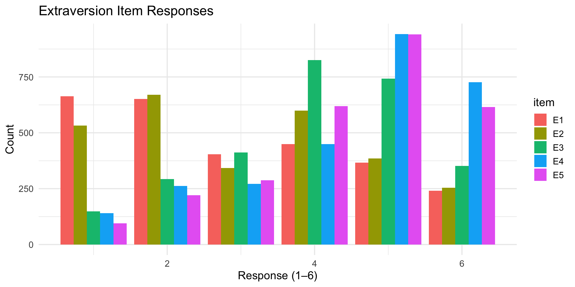
$ E1        <int> 3, 1, 2, 5, 2, 2, 4, 3, 5, 2, 1, 3, 3, 2, 3, 1, 1, 2, 1, 1, …
$ E2        <int> 3, 1, 4, 3, 2, 1, 3, 6, 3, 2, 3, 3, 3, 2, 4, 1, 2, 2, 2, 1, …
$ E3        <int> 3, 6, 4, 4, 5, 6, 4, 4, NA, 4, 2, 4, 3, 4, 3, 6, 5, 4, 4, 4,…
$ E4        <int> 4, 4, 4, 4, 4, 5, 5, 2, 4, 5, 5, 5, 2, 6, 6, 6, 5, 6, 5, 5, …
$ E5        <int> 4, 3, 5, 4, 5, 6, 5, 1, 3, 5, 4, 4, 4, 5, 5, 4, 5, 6, 5, 6, …
$ N1        <int> 3, 3, 4, 2, 2, 3, 1, 6, 5, 5, 3, 4, 1, 1, 2, 4, 4, 6, 5, 5, …
$ N2        <int> 4, 3, 5, 5, 3, 5, 2, 3, 5, 5, 3, 5, 2, 1, 4, 5, 4, 5, 6, 5, …
$ N3        <int> 2, 3, 4, 2, 4, 2, 2, 2, 2, 5, 4, 3, 2, 1, 2, 4, 4, 5, 5, 5, …
$ N4        <int> 2, 5, 2, 4, 4, 2, 1, 6, 3, 2, 2, 2, 2, 2, 2, 5, 4, 4, 5, 1, …
$ N5        <int> 3, 5, 3, 1, 3, 3, 1, 4, 3, 4, 3, NA, 2, 1, 3, 5, 5, 4, 2, 1,…
$ O1        <int> 3, 4, 4, 3, 3, 4, 5, 3, 6, 5, 5, 4, 4, 5, 5, 6, 5, 5, 4, 4, …
$ O2        <int> 6, 2, 2, 3, 3, 3, 2, 2, 6, 1, 3, 6, 2, 3, 2, 6, 1, 1, 2, 1, …
$ O3        <int> 3, 4, 5, 4, 4, 5, 5, 4, 6, 5, 5, 4, 4, 4, 5, 6, 5, 4, 2, 5, …
$ O4        <int> 4, 3, 5, 3, 3, 6, 6, 5, 6, 5, 6, 5, 5, 4, 5, 3, 6, 5, 4, 3, …
$ O5        <int> 3, 3, 2, 5, 3, 1, 1, 3, 1, 2, 3, 4, 2, 4, 5, 2, 3, 4, 2, 2, …
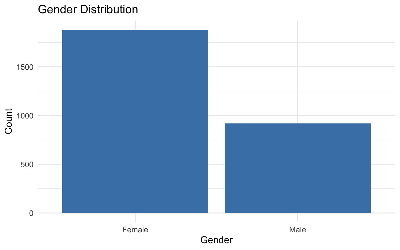
$ gender    <int> 1, 2, 2, 2, 1, 2, 1, 1, 1, 2, 1, 1, 2, 1, 1, 1, 2, 1, 2, 2, …
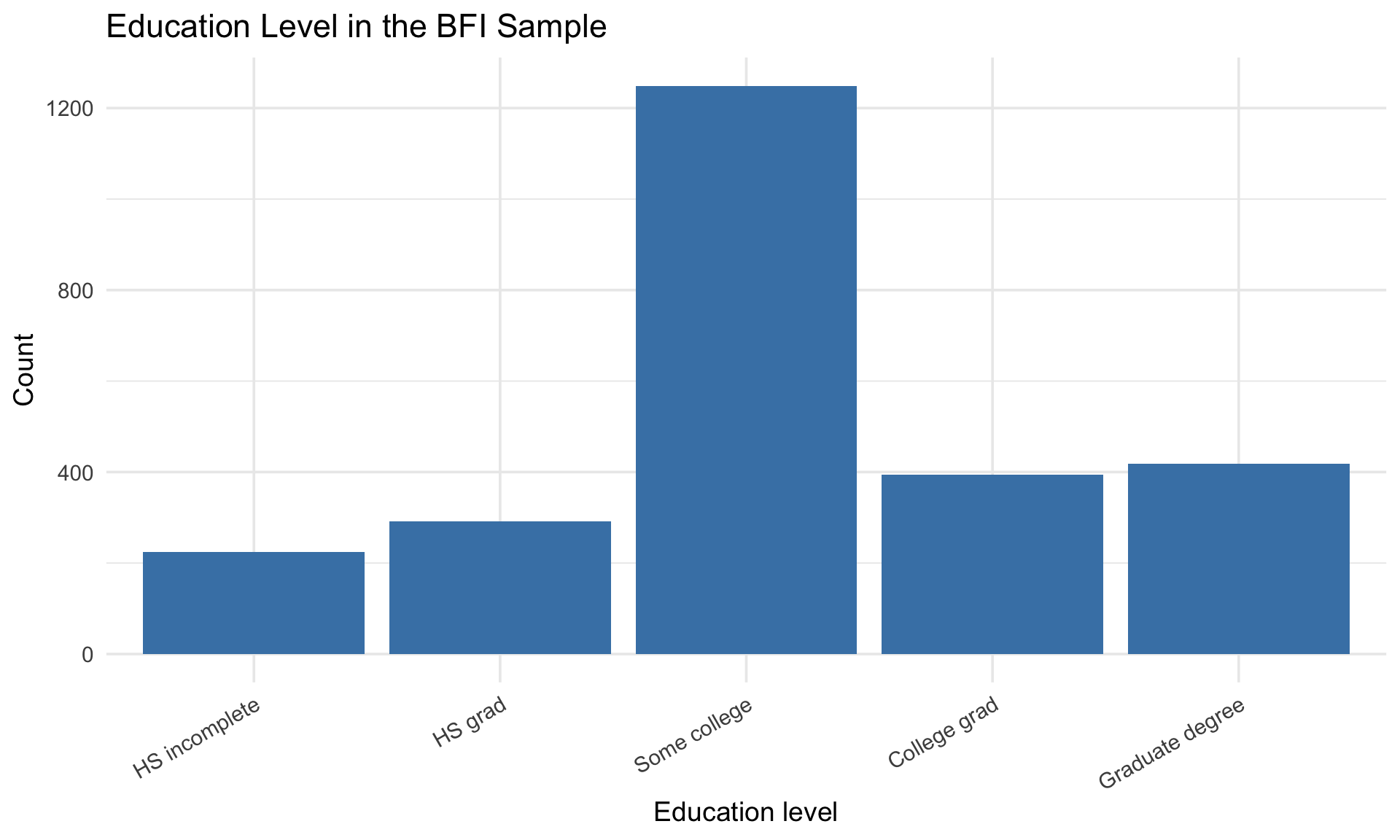
$ education <int> NA, NA, NA, NA, NA, 3, NA, 2, 1, NA, 1, NA, NA, NA, 1, NA, N…
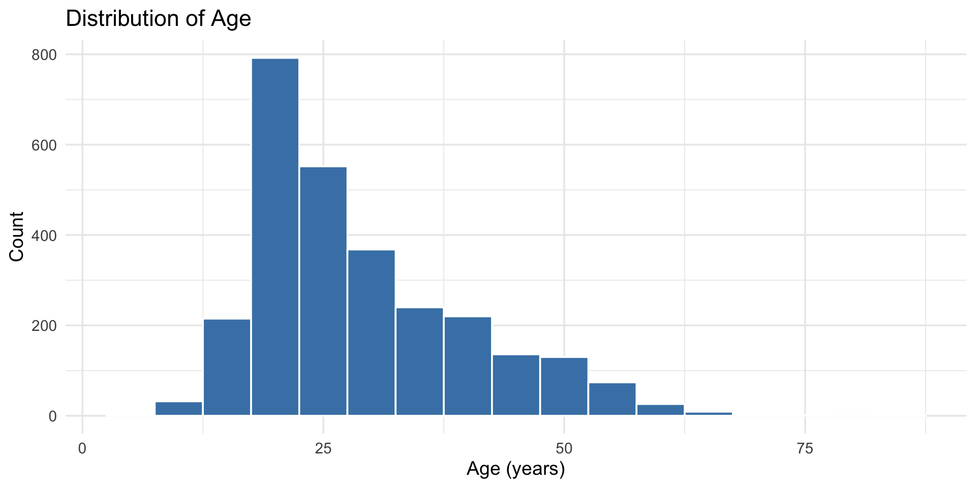
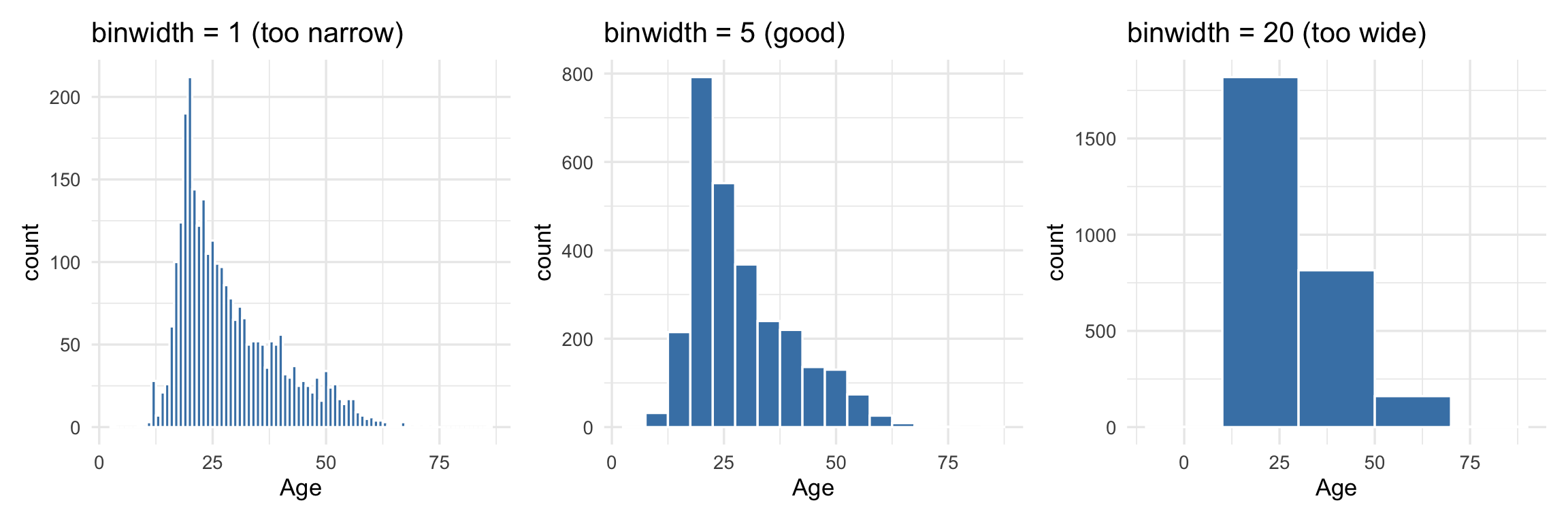
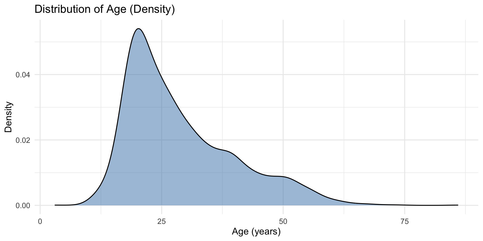
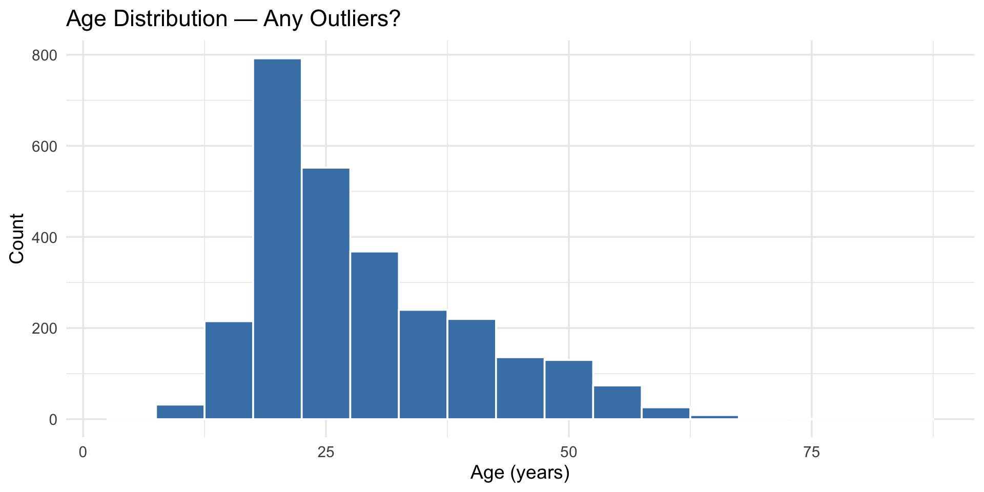
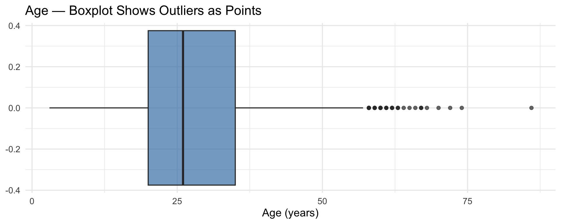
$ age       <int> 16, 18, 17, 17, 17, 21, 18, 19, 19, 17, 21, 16, 16, 16, 17, …

25 items measuring five personality factors (Agreeableness, Conscientiousness, Extraversion, Neuroticism, Openness) + demographics.

What’s in here

Variable Description
A1–A5 Agreeableness items (1–6 scale)
C1–C5 Conscientiousness items (1–6 scale)
E1–E5 Extraversion items (1–6 scale)
N1–N5 Neuroticism items (1–6 scale)
O1–O5 Openness items (1–6 scale)
gender 1 = male, 2 = female
education 1–5 (HS incomplete through graduate)
age Age in years

Exploring distributions

Start simple: summary statistics

bfi |>
  select(age, gender, education) |>
  summary()
      age            gender        education   
 Min.   : 3.00   Min.   :1.000   Min.   :1.00  
 1st Qu.:20.00   1st Qu.:1.000   1st Qu.:3.00  
 Median :26.00   Median :2.000   Median :3.00  
 Mean   :28.78   Mean   :1.672   Mean   :3.19  
 3rd Qu.:35.00   3rd Qu.:2.000   3rd Qu.:4.00  
 Max.   :86.00   Max.   :2.000   Max.   :5.00  
                                 NA's   :223   

But summary stats can hide a lot. Always visualize.

Histograms: the workhorse

bfi |>
  ggplot(aes(x = age)) +
  geom_histogram(binwidth = 5, fill = "steelblue", color = "white") +
  labs(
    title = "Distribution of Age",
    x = "Age (years)",
    y = "Count"
  ) +
  theme_minimal(base_size = 14)

Histograms: the workhorse

Histogram of participant ages with 5-year bins showing a strong right skew, with most participants in their teens to thirties and a long tail extending past age 60.

Choosing binwidth

The binwidth matters a lot:

Three histograms of age side by side comparing binwidths. Binwidth 1 is noisy with erratic spikes, binwidth 5 clearly shows the right-skewed shape, and binwidth 20 oversimplifies into just a few bars that hide the skew.

There’s no “right” answer — try a few and pick the one that shows the shape clearly.

Density plots: smooth alternative

bfi |>
  ggplot(aes(x = age)) +
  geom_density(fill = "steelblue", alpha = 0.5) +
  labs(
    title = "Distribution of Age (Density)",
    x = "Age (years)",
    y = "Density"
  ) +
  theme_minimal(base_size = 14)

Density plots: smooth alternative

Density plot of participant ages showing a smooth right-skewed curve that peaks around age 20 and gradually tapers off toward age 80.

Exploring survey items

# All Extraversion items
bfi |>
  select(E1:E5) |>
  pivot_longer(everything(), names_to = "item", values_to = "response") |>
  ggplot(aes(x = response, fill = item)) +
  geom_bar(position = "dodge") +
  labs(
    title = "Extraversion Item Responses",
    x = "Response (1–6)",
    y = "Count"
  ) +
  theme_minimal(base_size = 14)

Exploring survey items

Grouped bar chart of responses to five Extraversion items on a 1 to 6 scale. Items show different response patterns, with some skewing toward higher values and others toward lower values, reflecting reverse-scored items.

Categorical variables

bfi |>
  mutate(gender = ifelse(gender == 1, "Male", "Female")) |>
  ggplot(aes(x = gender)) +
  geom_bar(fill = "steelblue") +
  labs(
    title = "Gender Distribution",
    x = "Gender",
    y = "Count"
  ) +
  theme_minimal(base_size = 14)

Categorical variables

Bar chart of gender distribution showing roughly twice as many female participants as male participants in the BFI sample.

Counts and proportions

# Counts
bfi |>
  mutate(gender = ifelse(gender == 1, "Male", "Female")) |>
  count(gender)
# A tibble: 2 × 2
  gender     n
  <chr>  <int>
1 Female  1881
2 Male     919

Counts and proportions

# Proportions
bfi |>
  mutate(gender = ifelse(gender == 1, "Male", "Female")) |>
  count(gender) |>
  mutate(proportion = round(n / sum(n), 3))
# A tibble: 2 × 3
  gender     n proportion
  <chr>  <int>      <dbl>
1 Female  1881      0.672
2 Male     919      0.328

Outliers

What are outliers?

Values that are unusual compared to the rest of the data. They might be:

  • Real — genuinely extreme values (a 95-year-old in a college study)
  • Errors — data entry mistakes (age = 999)
  • Interesting — worth investigating

Never delete an outlier without understanding it.

Spotting outliers visually

bfi |>
  ggplot(aes(x = age)) +
  geom_histogram(binwidth = 5, fill = "steelblue", color = "white") +
  labs(
    title = "Age Distribution — Any Outliers?",
    x = "Age (years)",
    y = "Count"
  ) +
  theme_minimal(base_size = 14)

Spotting outliers visually

Histogram of participant ages with 5-year bins highlighting the right-skewed distribution, with a handful of participants beyond age 60 that could be considered outliers.

Spotting outliers with boxplots

bfi |>
  ggplot(aes(x = age)) +
  geom_boxplot(fill = "steelblue", alpha = 0.7) +
  labs(
    title = "Age — Boxplot Shows Outliers as Points",
    x = "Age (years)"
  ) +
  theme_minimal(base_size = 14)

Points beyond the whiskers are flagged as outliers by the 1.5×IQR rule.

Spotting outliers with boxplots

Horizontal boxplot of participant ages with the median around age 28, the box spanning roughly 20 to 40, and individual points plotted beyond the upper whisker indicating older outliers.

Investigating outliers programmatically

# Find unusually old or young participants
bfi |>
  filter(age > 60) |>
  select(age, gender, education)
# A tibble: 22 × 3
     age gender education
   <int>  <int>     <int>
 1    68      1         5
 2    64      2         5
 3    74      1         5
 4    63      2         3
 5    62      1         2
 6    86      2         2
 7    61      1         2
 8    67      1         5
 9    67      1         5
10    63      1         5
# ℹ 12 more rows

What to do with outliers

Outlier type What to do
Likely error (age = 999) Fix or set to NA
Real but extreme Note it, keep it, mention in write-up
Suspicious Investigate further
Doesn’t affect conclusions Keep it, move on

Document your decisions. Future you will want to know.

Let’s explore YOUR data

Our class survey

Remember that survey you filled out Week 1? Let’s do some EDA on it.

glimpse(class_survey)
Rows: 50
Columns: 15
$ response_id       <chr> "R_20iIOAJEaVmz5Zk", "R_e3DiO3MhM6wfJQ2", "R_0InWoRP…
$ major             <chr> "Other", "Psychology", "Neuroscience", "Psychology",…
$ year              <chr> "Senior", NA, "Graduate Student", "Graduate Student"…
$ chronotype        <chr> "Evening person", NA, NA, "Neither", "Morning person…
$ sleep_hrs         <dbl> 1, 24, 5, 7, 22, 15, 15, 6, 5, 1, 0, 15, 2, 6, 15, 2…
$ caffeine_per_day  <dbl> 14, 49, 20, 36, 49, 43, 41, 2, 2, 25, 25, 36, 27, 12…
$ social_media_hrs  <dbl> 17, 3, 9, 6, 17, 4, 3, 5, 18, 0, 16, 18, 13, 6, 4, 8…
$ tabs_open         <dbl> 2053973334, 433352542, 2034125456, 838228790, 117352…
$ stress            <dbl> 4, 9, NA, NA, 4, NA, 7, 5, NA, NA, 2, NA, NA, 7, 8, …
$ coding_excited    <dbl> NA, 2, 4, 5, NA, 6, 9, 4, NA, NA, 5, NA, 5, 6, 9, 5,…
$ coding_anxious    <dbl> 5, 8, NA, 4, 5, 7, 5, 2, 9, NA, NA, NA, 8, 6, 7, 7, …
$ personality_neur  <dbl> 9, 4, 8, 8, 7, 7, 8, 9, 7, 6, 2, 3, 7, NA, 3, NA, NA…
$ personality_extra <dbl> 6, NA, 6, 6, 6, 3, NA, 3, NA, 2, 2, 8, 4, NA, NA, NA…
$ personality_consc <dbl> 5, 5, 2, 5, NA, 3, NA, 4, 3, 4, 9, NA, 5, 4, 8, NA, …
$ data_words        <chr> "natoque imperdiet ligula commodo! convallis accusam…

How many tabs do you have open?

ggplot(class_survey, aes(x = tabs_open)) +
  geom_histogram(binwidth = 5, fill = "steelblue", color = "white") +
  labs(
    title = "Browser Tabs Open During the Survey",
    x = "Number of tabs",
    y = "Count"
  ) +
  theme_minimal(base_size = 14)

How many tabs do you have open?

Histogram of browser tabs open showing a right-skewed distribution, with most students reporting fewer than 20 tabs and a few extreme values stretching the distribution.

How does our class sleep?

ggplot(class_survey, aes(x = sleep_hrs)) +
  geom_histogram(binwidth = 1, fill = "steelblue", color = "white") +
  labs(
    title = "How Much Sleep Does Our Class Get?",
    x = "Average hours of sleep per night",
    y = "Count"
  ) +
  theme_minimal(base_size = 14)

How does our class sleep?

Histogram of average hours of sleep per night reported by students, showing the distribution centered around 7 hours.

Morning people or night owls?

ggplot(class_survey, aes(x = chronotype)) +
  geom_bar(fill = "steelblue") +
  labs(
    title = "Chronotype Distribution in Our Class",
    x = "Chronotype",
    y = "Count"
  ) +
  theme_minimal(base_size = 14)

Morning people or night owls?

Bar chart of chronotype distribution showing counts of students who identify as morning person, evening person, or neither.

Pair coding break

Your turn: 10 minutes

Using the penguins dataset (from the palmerpenguins package):

  1. Plot the distribution of flipper_length_mm — what shape is it?
  2. Check for outliers in flipper length. Are any values suspicious?

Tip

Try both a histogram and a boxplot. They show different things. Use summary() first to get oriented.

Before we move on

📤 Upload your code to Canvas for participation credit. Paste what you have into today’s in-class submission — it doesn’t need to work perfectly.

Missing data — a first look

Missing data is everywhere

# How much missing data do we have?
bfi |>
  summarize(across(everything(), ~ sum(is.na(.)))) |>
  pivot_longer(everything(), names_to = "variable", values_to = "n_missing") |>
  arrange(desc(n_missing))
# A tibble: 28 × 2
   variable  n_missing
   <chr>         <int>
 1 education       223
 2 N4               36
 3 N5               29
 4 O3               28
 5 A2               27
 6 A3               26
 7 C4               26
 8 E3               25
 9 C2               24
10 E1               23
# ℹ 18 more rows

Visualizing missingness

bfi |>
  summarize(across(everything(), ~ mean(is.na(.)))) |>
  pivot_longer(everything(), names_to = "variable", values_to = "pct_missing") |>
  mutate(pct_missing = pct_missing * 100) |>
  filter(pct_missing > 0) |>
  arrange(desc(pct_missing)) |>
  ggplot(aes(x = reorder(variable, pct_missing), y = pct_missing)) +
  geom_col(fill = "steelblue") +
  coord_flip() +
  labs(
    title = "Percentage of Missing Values by Variable",
    x = "Variable",
    y = "% Missing"
  ) +
  theme_minimal(base_size = 14)

Visualizing missingness

Horizontal bar chart showing the percentage of missing values for each variable that has any missingness. Education has the highest rate at around 7 percent, followed by several personality items with lower rates.

Why it matters for EDA

Missing data can bias your exploration:

  • If missingness is related to the variables you’re studying, your distributions are wrong
  • If certain groups are more likely to have missing data, you might miss important patterns

We’ll cover this in depth in Session 14. For now: always check for missing data before exploring.

The EDA workflow

A systematic approach

  1. Look at the structureglimpse(), summary()
  2. Check for missing data — how much? Which variables?
  3. Explore each variable — histograms, bar charts, summaries
  4. Look for outliers — boxplots, programmatic checks
  5. Ask questions — what surprised you? What do you want to know more about?
  6. Repeat — EDA is iterative

Putting it together: a mini-EDA

# Education distribution — what does it look like?
bfi |>
  filter(!is.na(education)) |>
  mutate(education = factor(education, labels = c(
    "HS incomplete", "HS grad", "Some college",
    "College grad", "Graduate degree"
  ))) |>
  ggplot(aes(x = education)) +
  geom_bar(fill = "steelblue") +
  labs(
    title = "Education Level in the BFI Sample",
    x = "Education level",
    y = "Count"
  ) +
  theme_minimal(base_size = 14) +
  theme(axis.text.x = element_text(angle = 30, hjust = 1))

Putting it together: a mini-EDA

Bar chart of education levels in the BFI sample showing the most common category is some college, followed by college graduate and high school graduate, with fewer participants at the extremes of high school incomplete and graduate degree.

Get a head start

Assignment 5 preview

Assignment 5 will have you do a full EDA on a psychology dataset. Start now:

  1. Load bfi and run glimpse() and summary()
  2. Pick 3 variables and create distributions for each
  3. For each one: What shape is it? Any outliers? Any missing data?
  4. Write down one question each distribution makes you want to ask

That’s the core of EDA — noticing things and getting curious.

Wrapping up

EDA toolkit so far

Tool When to use
glimpse() First look at structure
summary() Quick numeric summaries
geom_histogram() Continuous distributions
geom_density() Smooth distribution shape
geom_bar() Categorical distributions
geom_boxplot() Outlier detection
count() Frequency tables
is.na() / sum(is.na()) Missing data check

Before next class

📖 Read:

Practice:

  • Explore at least 3 variables in bfi
  • Look for outliers and missing data
  • Start generating questions

Key takeaways

  1. EDA is an attitude — curiosity, not confirmation
  2. Always visualize — summary stats hide patterns
  3. Outliers are information — investigate, don’t delete
  4. Check missing data first — it affects everything
  5. Ask questions, then answer them — that’s the loop

The one thing to remember

EDA isn’t a step you finish. It’s the habit of looking at your data before you believe anything about it.

Next time: EDA — Covariation