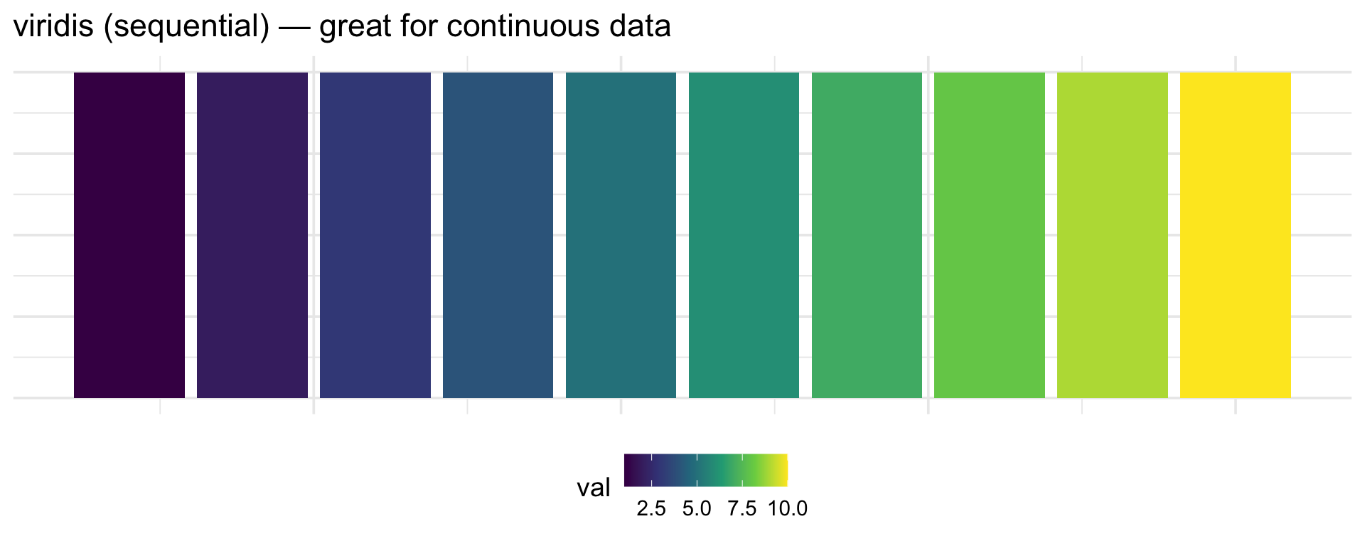
# viridis is colorblind-safe AND sequential
scale_fill_viridis_d()   # discrete
scale_fill_viridis_c()   # continuous

# ColorBrewer palettes designed for colorblindness
scale_fill_brewer(palette = "Set2")

# Or set colors manually with safe choices
scale_fill_manual(values = c("#0072B2", "#E69F00", "#009E73"))
# (blue, orange, green — distinguishable for most color vision types)Perception & Design
PSY 410: Data Science for Psychology
2026-04-22
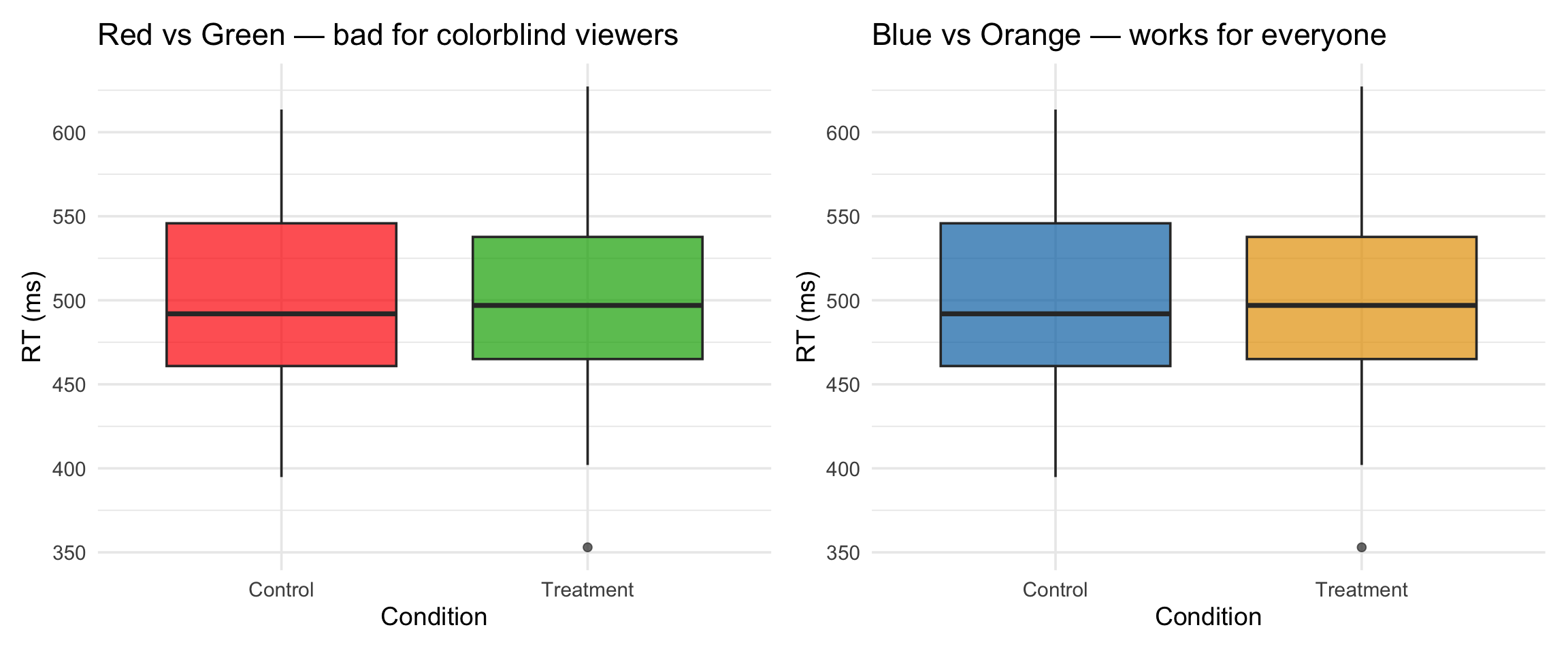
What’s wrong with this?
Red-green palette (colorblind-unfriendly). No informative title. Tiny text. Gridline noise. Bars hiding the data.
Today we learn why your brain rejects bad figures — and how to design ones that work.
Preattentive in action
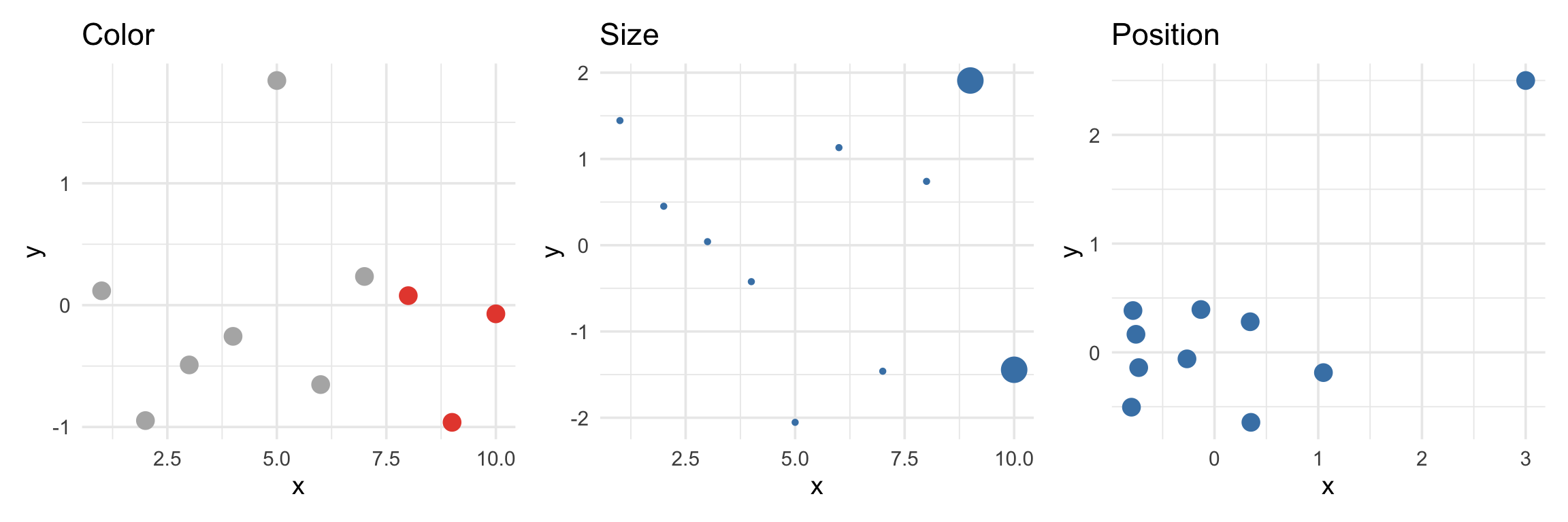
Your eye goes to the red points, the big points, and the outlier — instantly.
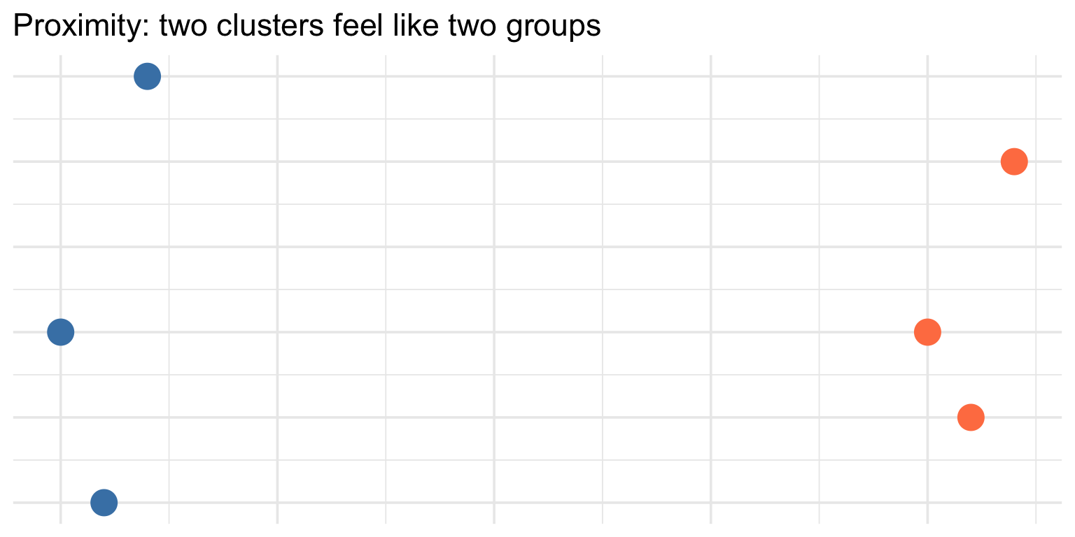
Gestalt principles (brief)
The brain groups things automatically:
- Proximity — things close together feel like a group
- Similarity — things that look alike feel like a group
- Enclosure — things inside a border feel like a group
Sequential palettes
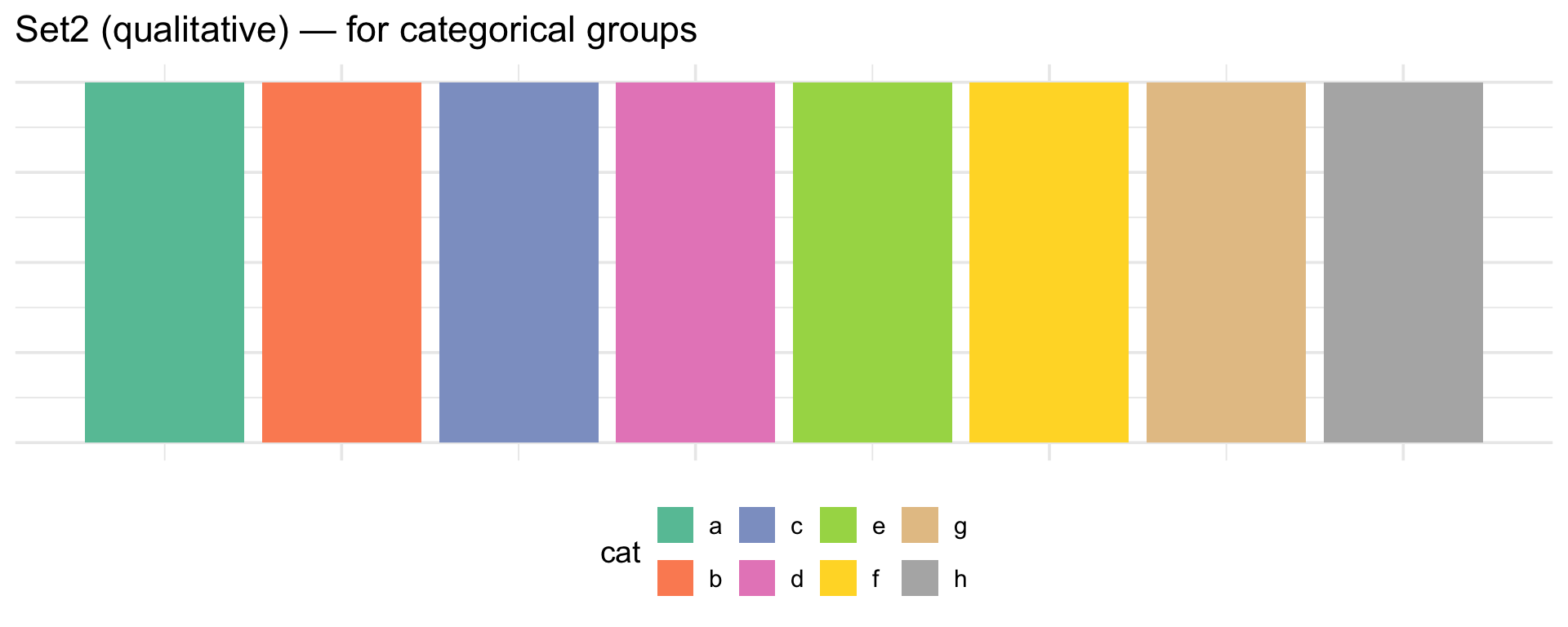
Qualitative palettes
A bad color choice vs a good one
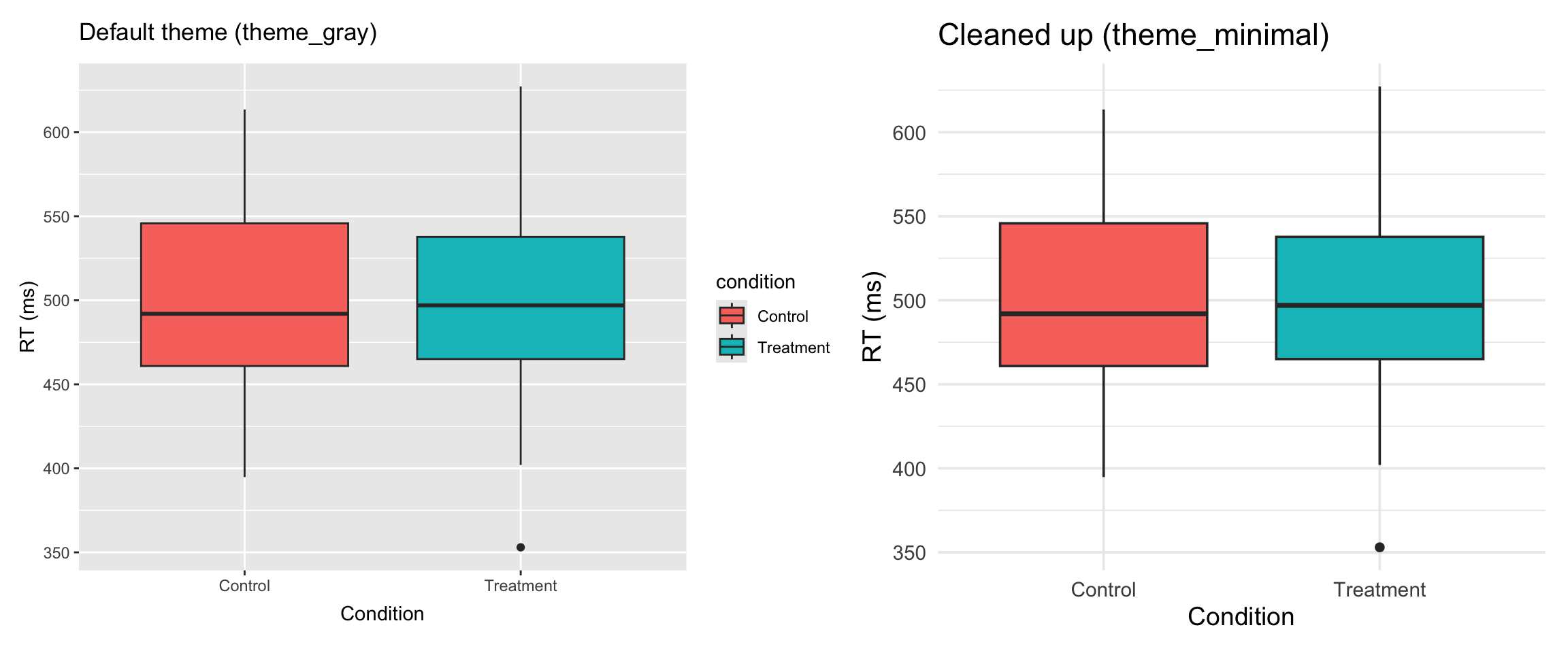
The default is cluttered
ggplot2’s default theme adds a lot of visual noise. Compare:
Your turn: 10 minutes
# The cluttered version — fix this!
reaction_data |>
  ggplot(aes(x = condition, y = rt, fill = condition, color = condition, size = accuracy)) +
  geom_point() +
  geom_boxplot(alpha = 0.3) +
  scale_fill_manual(values = c("Control" = "red", "Treatment" = "green")) +
  scale_color_manual(values = c("Control" = "red", "Treatment" = "green")) +
  labs(x = "condition", y = "rt") +
  ggtitle("data") +
  theme_gray()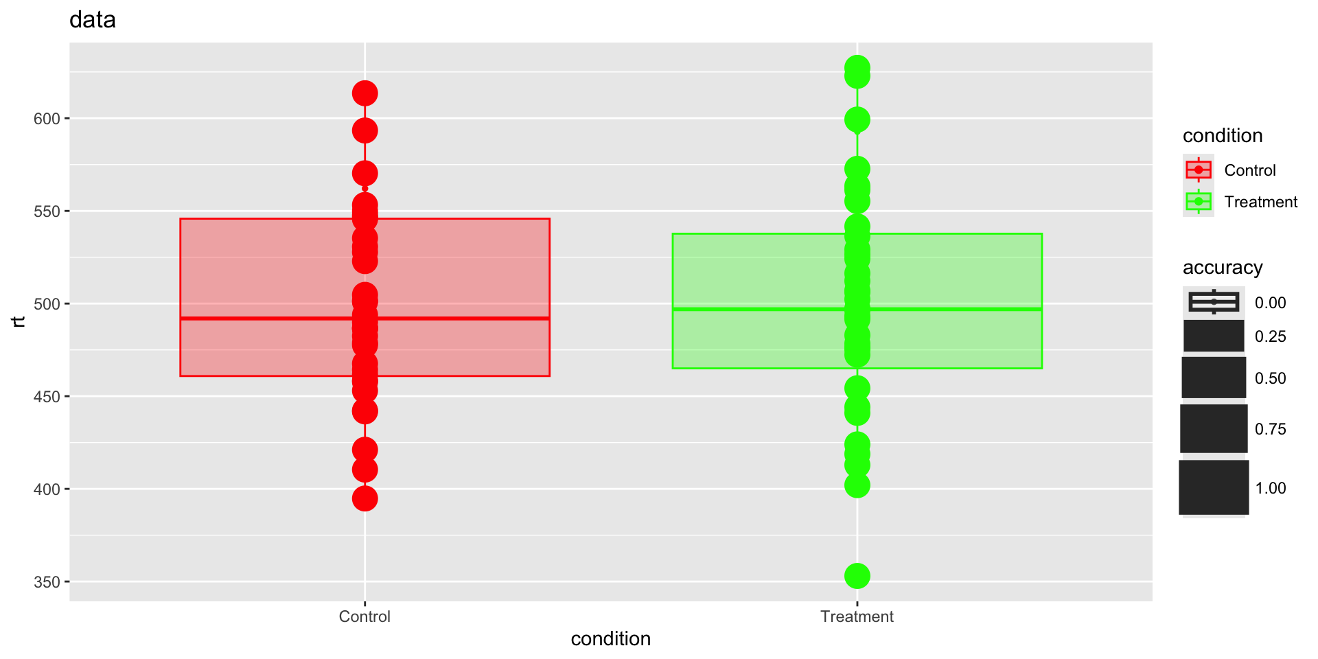
What’s wrong here? (1 of 3)
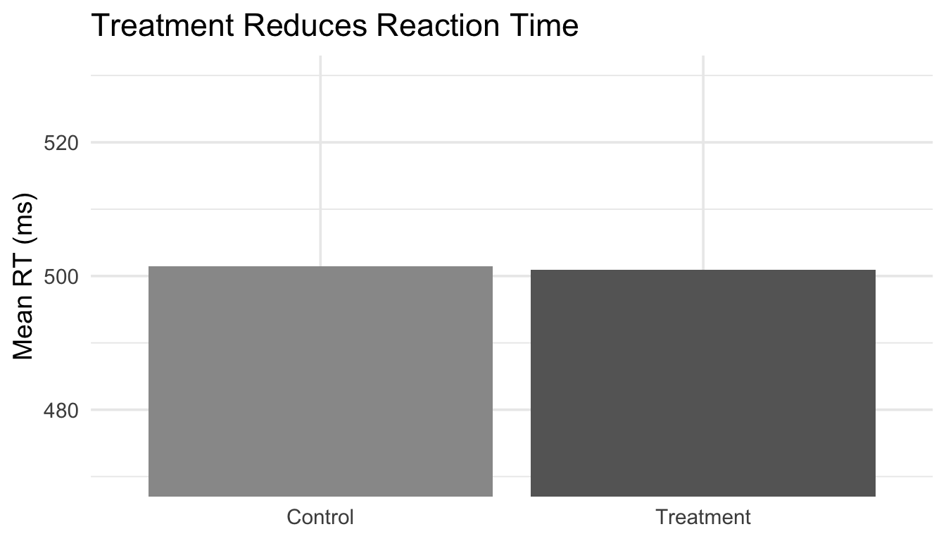
The problem: The y-axis starts at 470, not 0. The difference looks massive — but it’s only ~40 ms. A truncated axis exaggerates the effect.
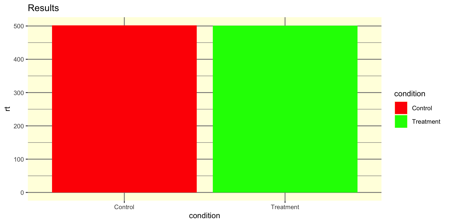
What’s wrong here? (2 of 3)
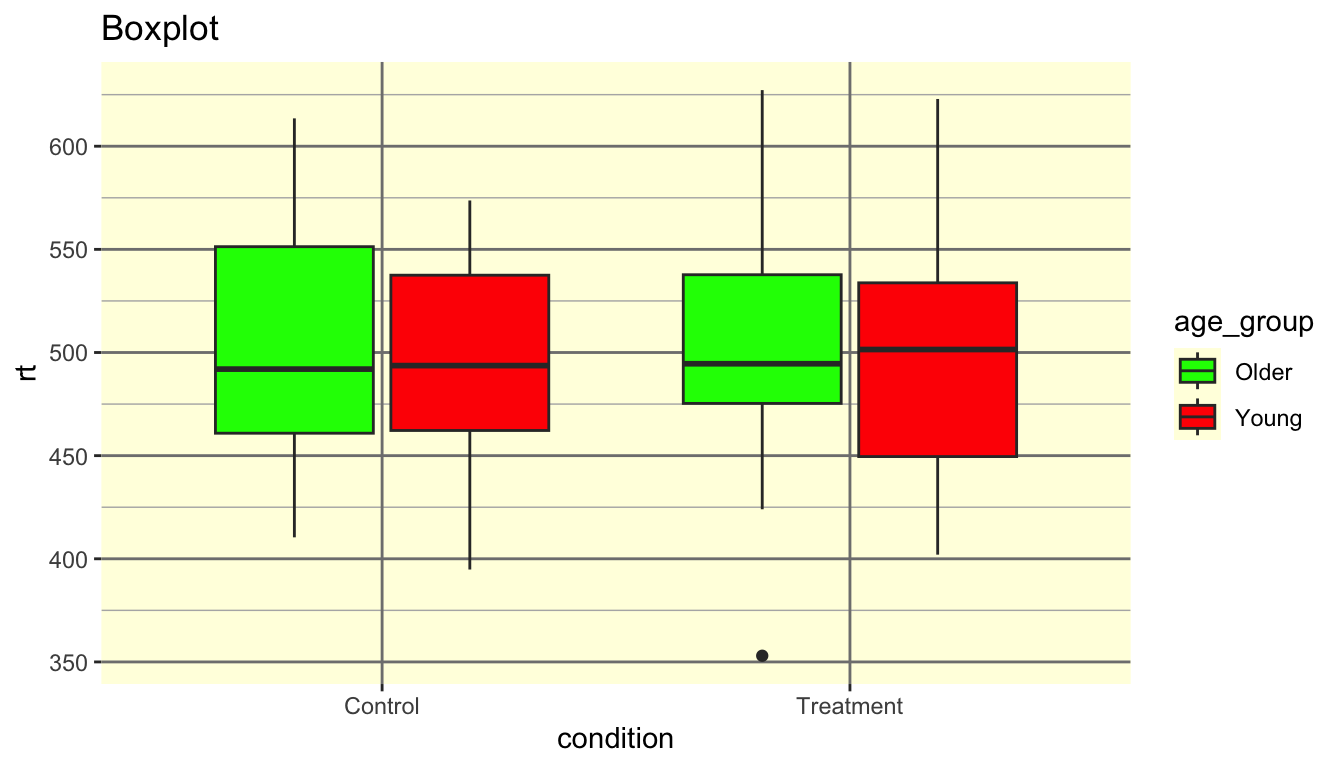
The problems: Red-green palette (colorblind-unfriendly). Title says “Boxplot” (a label, not a finding). Variable names as labels. Distracting background color and gridlines.
What’s wrong here? (3 of 3)
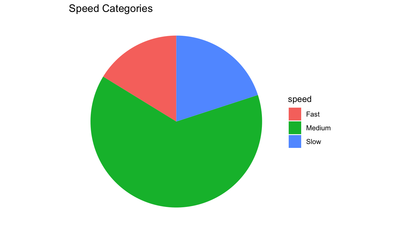
The problems: Continuous data was binned into arbitrary categories, then displayed as a pie chart. We lost the actual reaction times, the condition comparison, and the ability to see distributions. A histogram or density plot would show far more.