| set | mean_x | mean_y | sd_x | sd_y | cor |
|---|---|---|---|---|---|
| 1 | 9 | 7.5 | 3.32 | 2.03 | 0.82 |
| 2 | 9 | 7.5 | 3.32 | 2.03 | 0.82 |
| 3 | 9 | 7.5 | 3.32 | 2.03 | 0.82 |
| 4 | 9 | 7.5 | 3.32 | 2.03 | 0.82 |
Your First Visualization
PSY 410: Data Science for Psychology
Dr. Sara Weston
2026-04-01
Why visualize?
Anscombe’s Quartet
Four datasets with identical summary statistics:
But look at the plots!
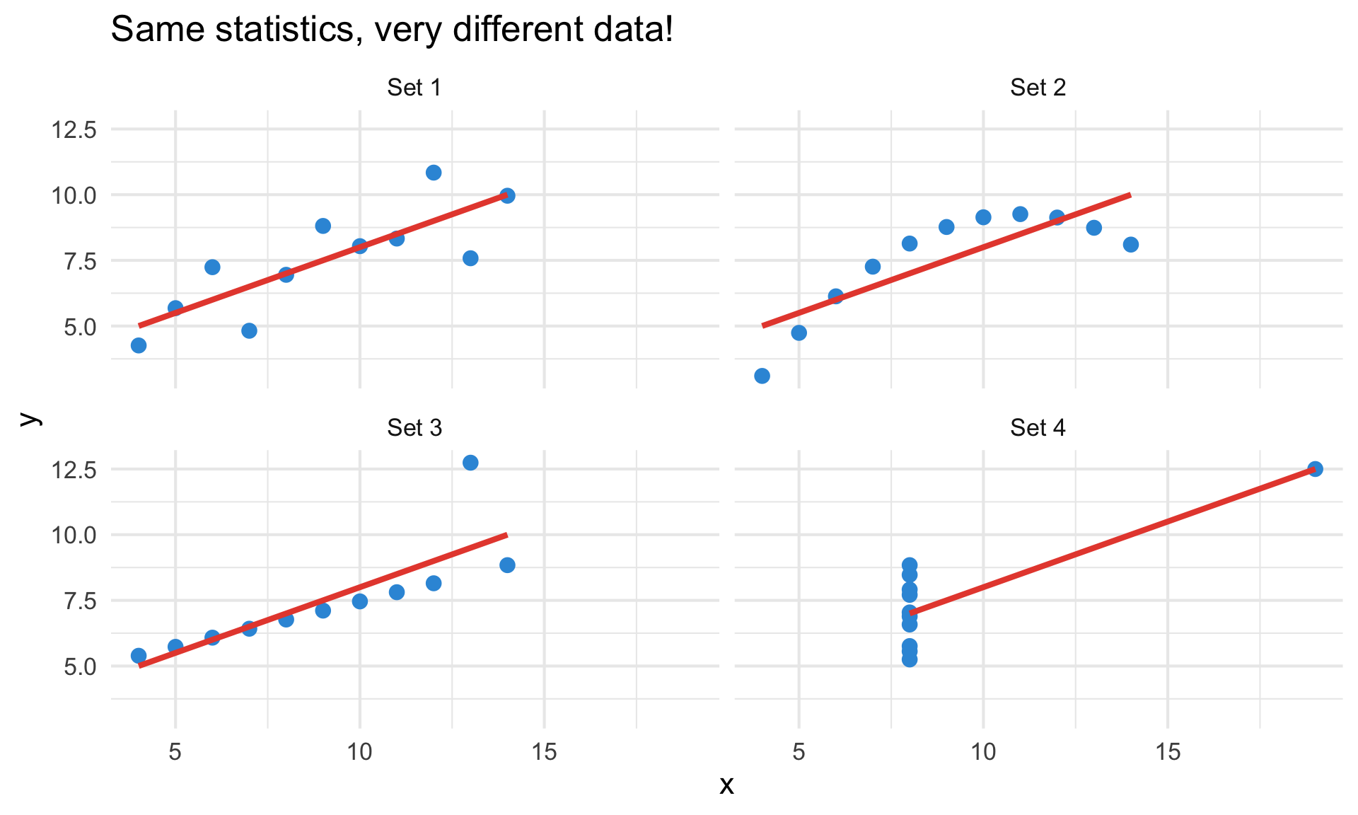
Always visualize your data before running statistics.
Introduction to ggplot2
ggplot2 builds plots in layers, like a grammar
- Created by Hadley Wickham (2005)
- Based on the Grammar of Graphics by Leland Wilkinson
- Most popular R visualization package
- Part of the tidyverse
The “gg” stands for “Grammar of Graphics”
The grammar of graphics
Every ggplot has three essential components:
- Data — what you want to visualize
- Aesthetics (aes) — how variables map to visual properties
- Geoms — what geometric shapes represent the data
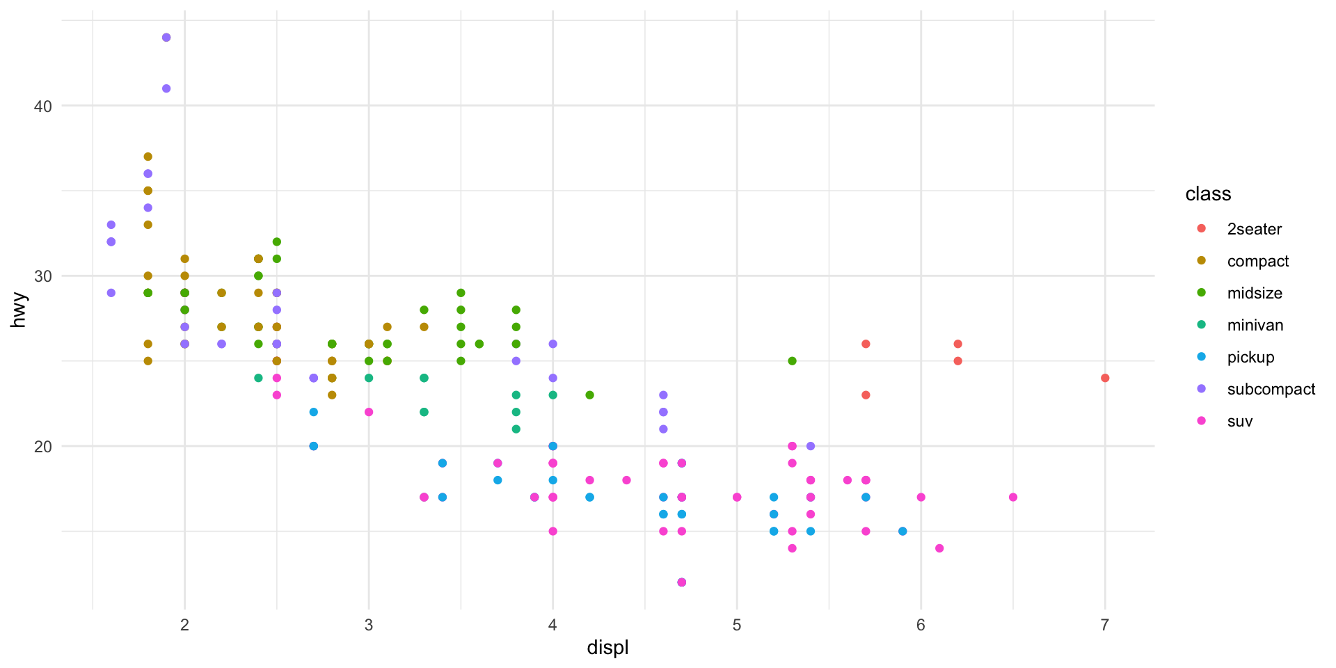
Our dataset: mpg
Rows: 234
Columns: 11
$ manufacturer <chr> "audi", "audi", "audi", "audi", "audi", "audi", "audi", "…
$ model        <chr> "a4", "a4", "a4", "a4", "a4", "a4", "a4", "a4 quattro", "…
$ displ        <dbl> 1.8, 1.8, 2.0, 2.0, 2.8, 2.8, 3.1, 1.8, 1.8, 2.0, 2.0, 2.…
$ year         <int> 1999, 1999, 2008, 2008, 1999, 1999, 2008, 1999, 1999, 200…
$ cyl          <int> 4, 4, 4, 4, 6, 6, 6, 4, 4, 4, 4, 6, 6, 6, 6, 6, 6, 8, 8, …
$ trans        <chr> "auto(l5)", "manual(m5)", "manual(m6)", "auto(av)", "auto…
$ drv          <chr> "f", "f", "f", "f", "f", "f", "f", "4", "4", "4", "4", "4…
$ cty          <int> 18, 21, 20, 21, 16, 18, 18, 18, 16, 20, 19, 15, 17, 17, 1…
$ hwy          <int> 29, 29, 31, 30, 26, 26, 27, 26, 25, 28, 27, 25, 25, 25, 2…
$ fl           <chr> "p", "p", "p", "p", "p", "p", "p", "p", "p", "p", "p", "p…
$ class <chr> "compact", "compact", "compact", "compact", "compact", "c…Your first plot
Your first plot
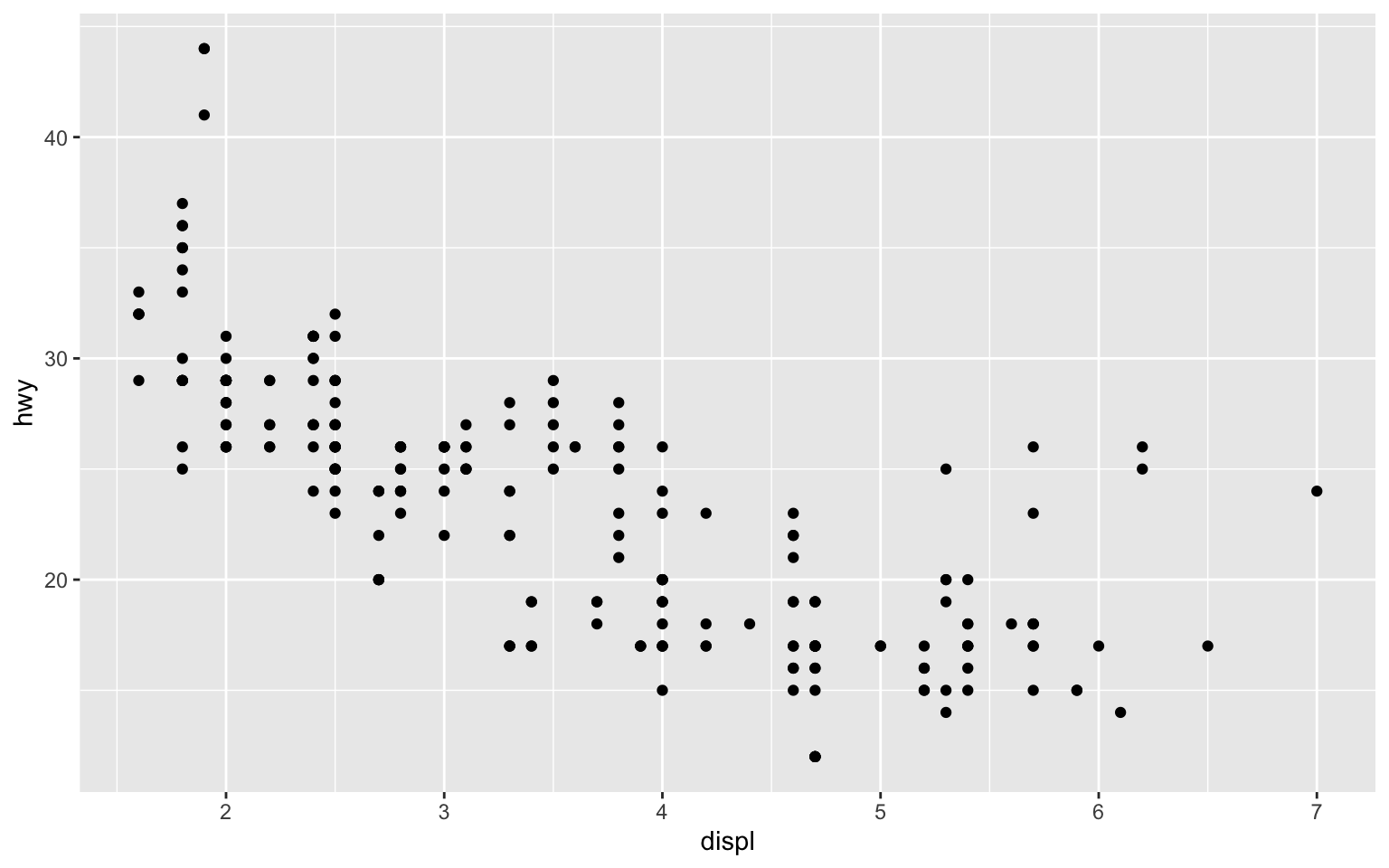
Breaking it down
data = mpg— use the mpg datasetaes(x = displ, y = hwy)— map displacement to x, highway mpg to ygeom_point()— represent data as points
Aesthetic mappings
What are aesthetics?
Aesthetics are visual properties of geoms:
x,y— positioncolor— outline or line colorfill— interior color (bars, boxes)size,shape,alpha— size, shape, and transparency
We’ll focus on color today — you’ll explore the others in assignments.
Mapping color to a variable
What if we want to see which points are which car class?
Mapping color to a variable
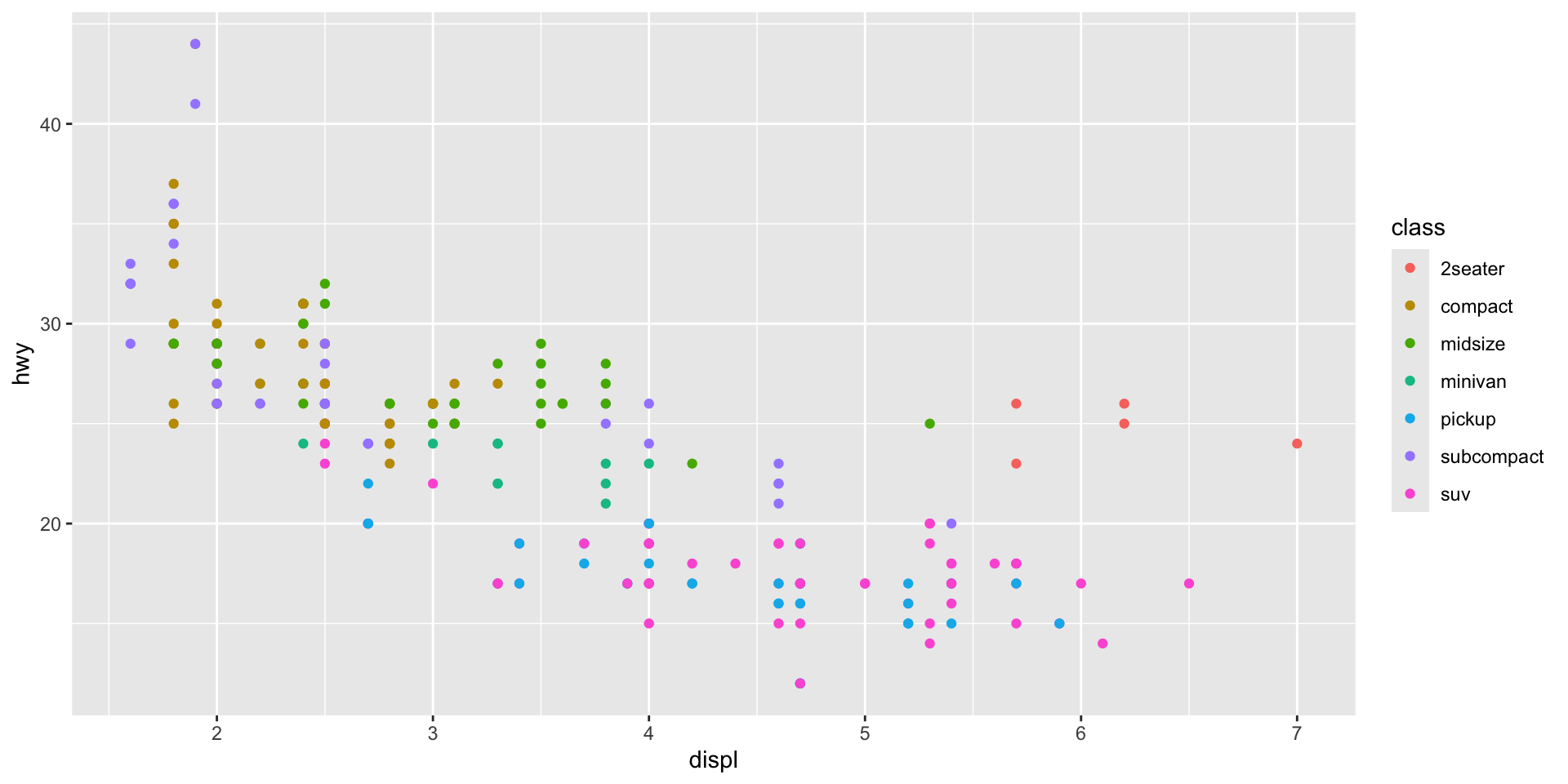
Setting vs. mapping
Mapping — aesthetic varies with data (inside aes())
Setting — aesthetic is constant (outside aes())
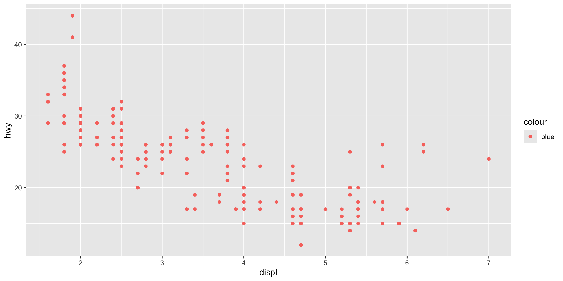
Common mistake!
ggplot thinks “blue” is a category name!
Common mistake!
Different data types need different geoms
Common geoms
| Geom | What it makes |
|---|---|
geom_point() |
Scatterplot |
geom_line() |
Line graph |
geom_bar() |
Bar chart |
geom_histogram() |
Histogram |
geom_boxplot() |
Box plot |
geom_smooth() |
Smoothed line |
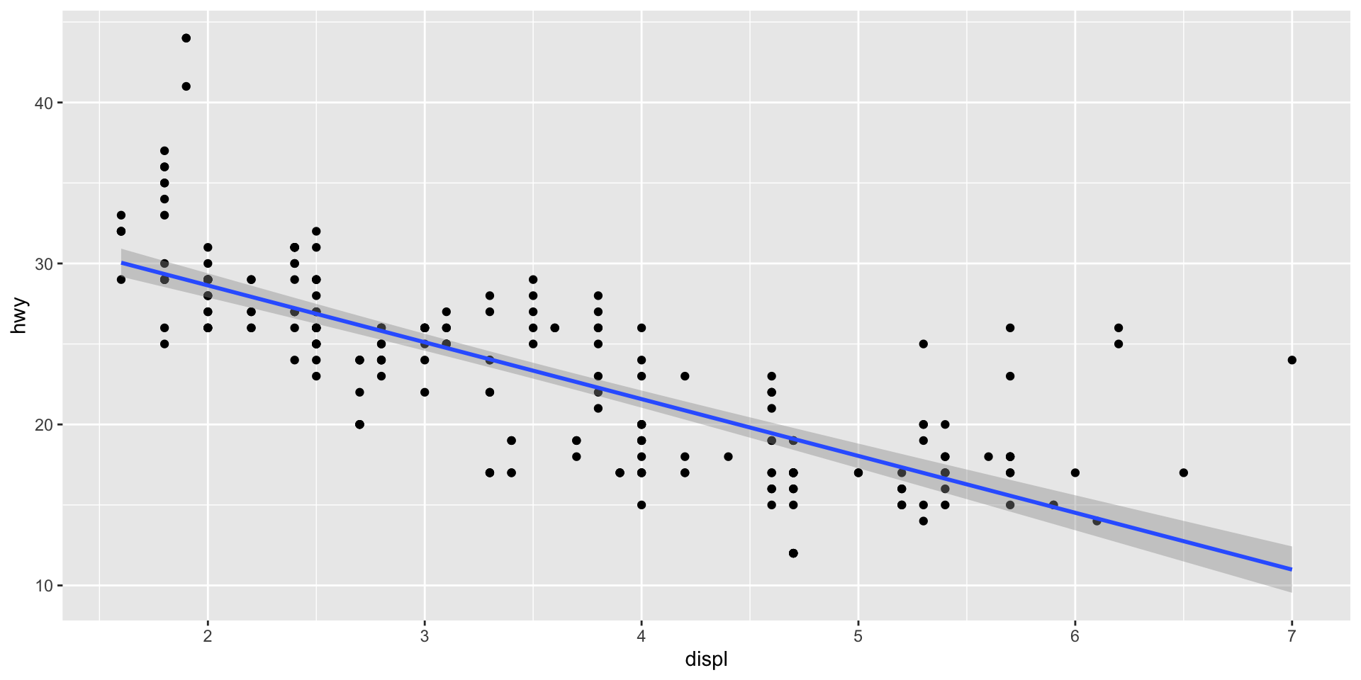
geom_smooth()
Add a trend line to your scatterplot:
geom_smooth()
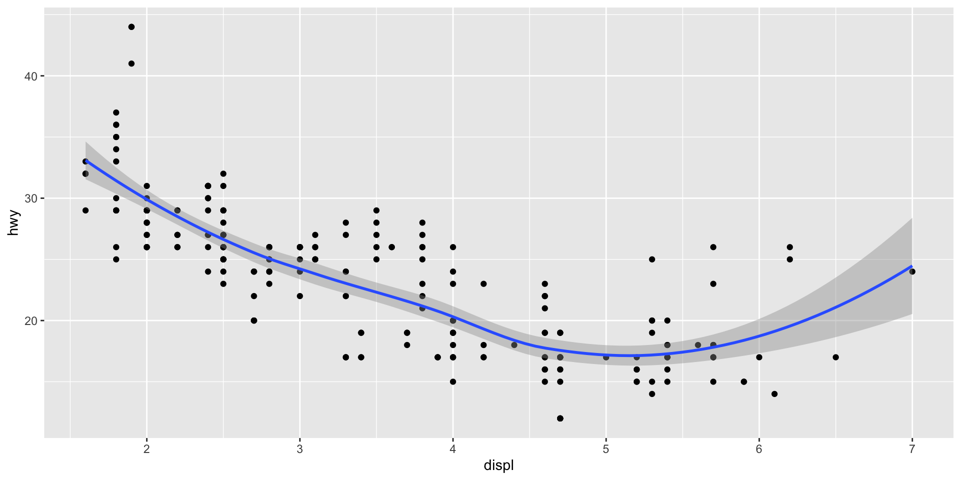
Linear trend line
Linear trend line
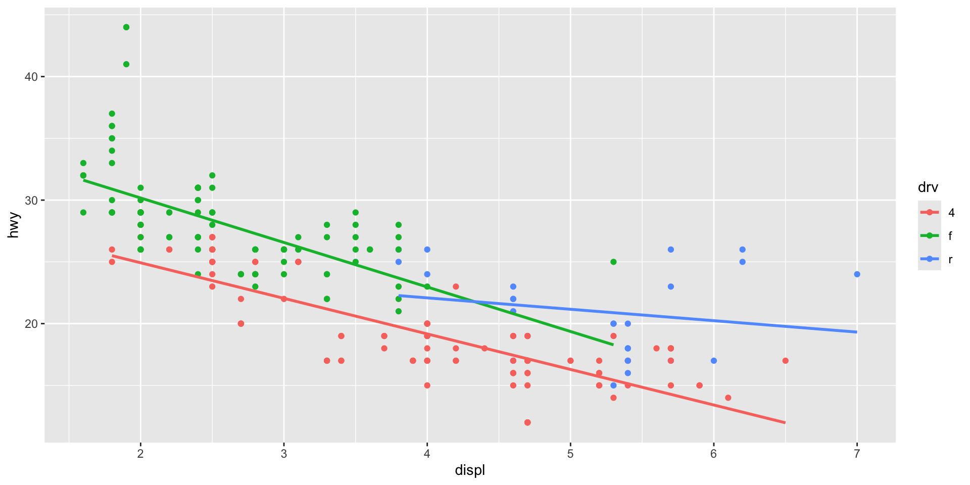
Layering geoms
Each + adds a layer:
Layering geoms
Pair coding break
Your turn: 10 minutes
With a partner, create a scatterplot using the mpg dataset:
- Plot
cty(x-axis) vshwy(y-axis) - Color points by fuel type (
fl) - Add a smooth trend line
- Give it a title and axis labels
- Who can make theirs look the best?
Tip
You have everything you need from the last few slides. Start with the basic template and build from there.
Before we move on
📤 Upload your code to Canvas for participation credit. Paste what you have into today’s in-class submission — it doesn’t need to work perfectly.
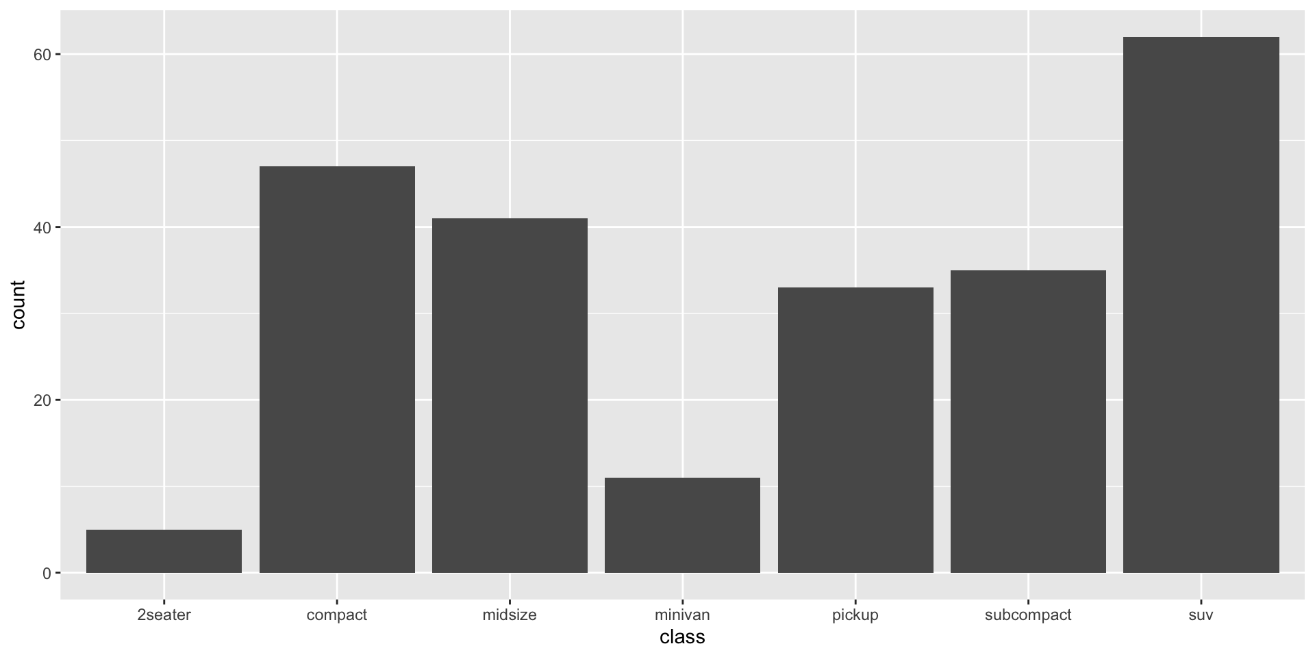
geom_bar() — categorical data
geom_bar() — categorical data
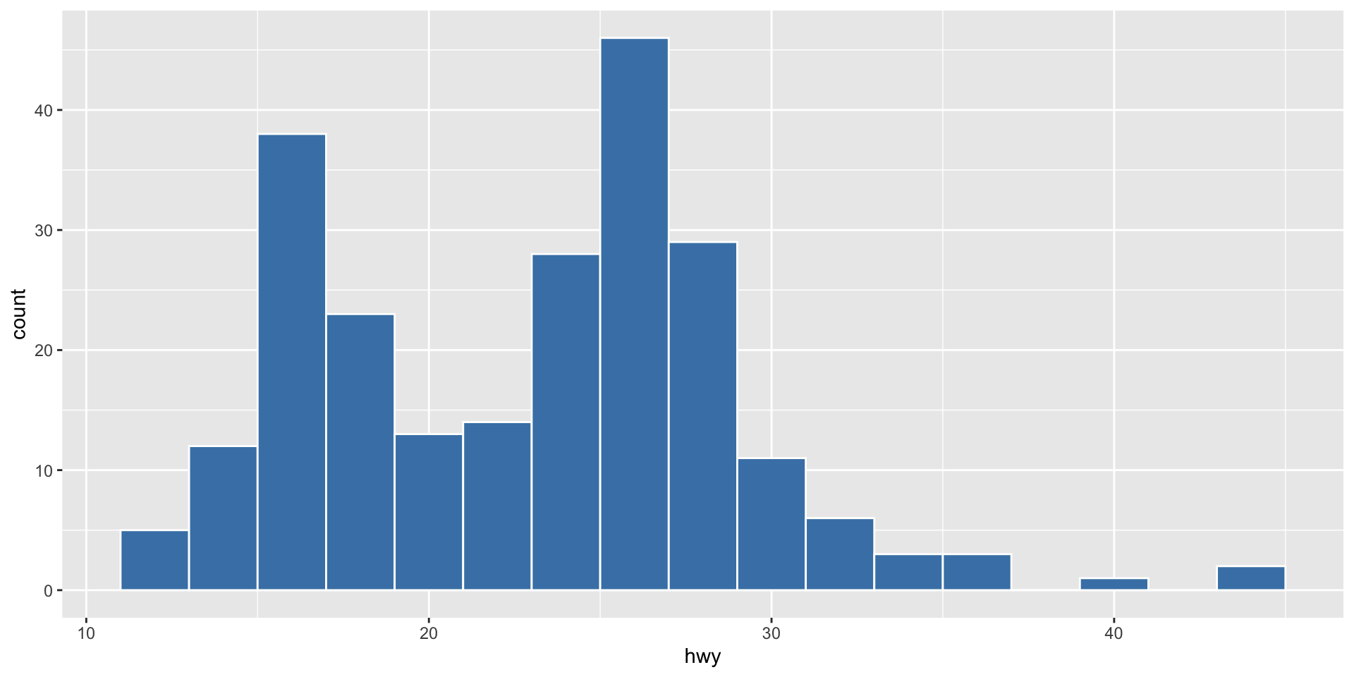
geom_histogram() — distributions
geom_histogram() — distributions
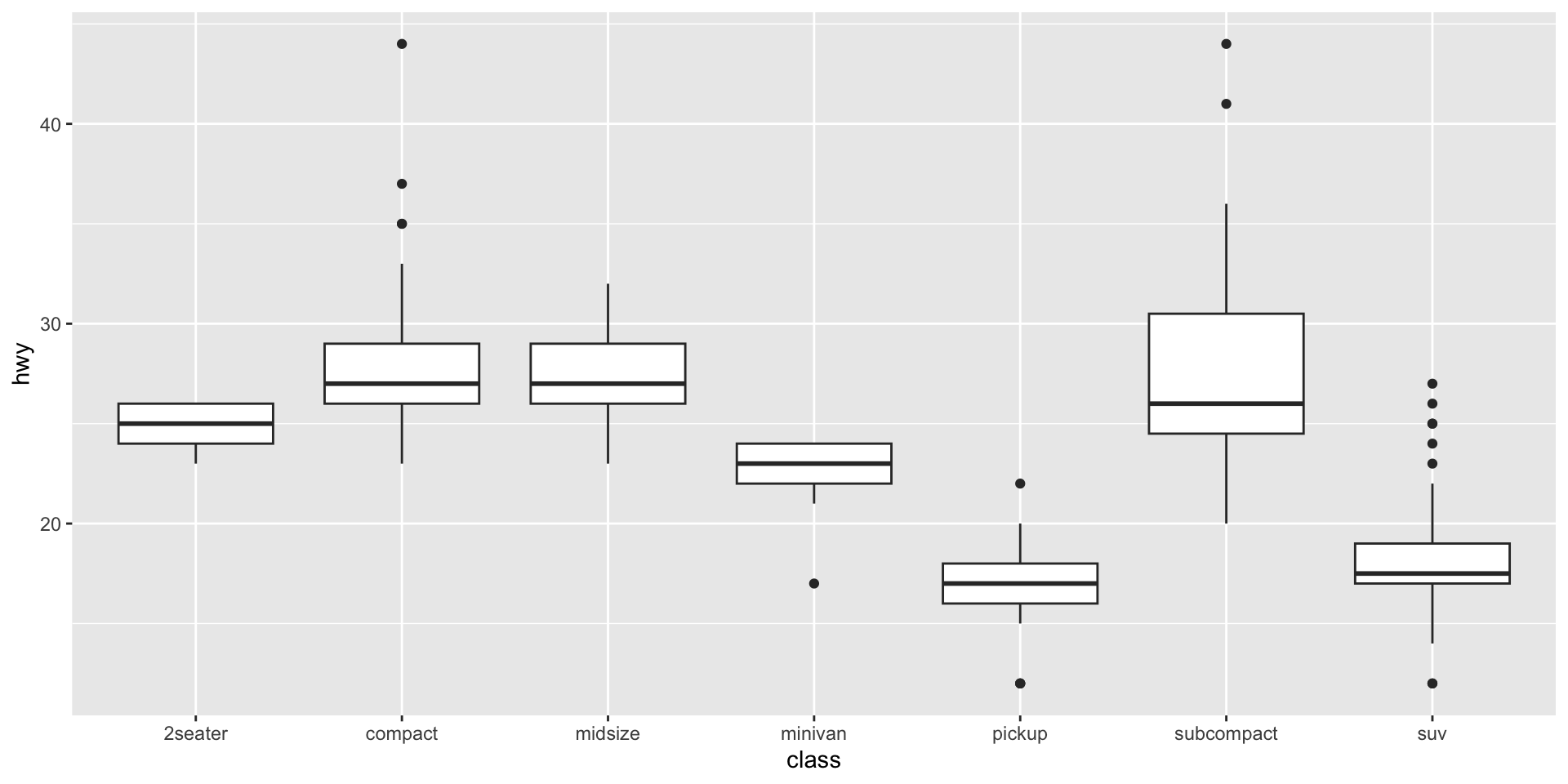
geom_boxplot() — comparing groups
geom_boxplot() — comparing groups
Facets
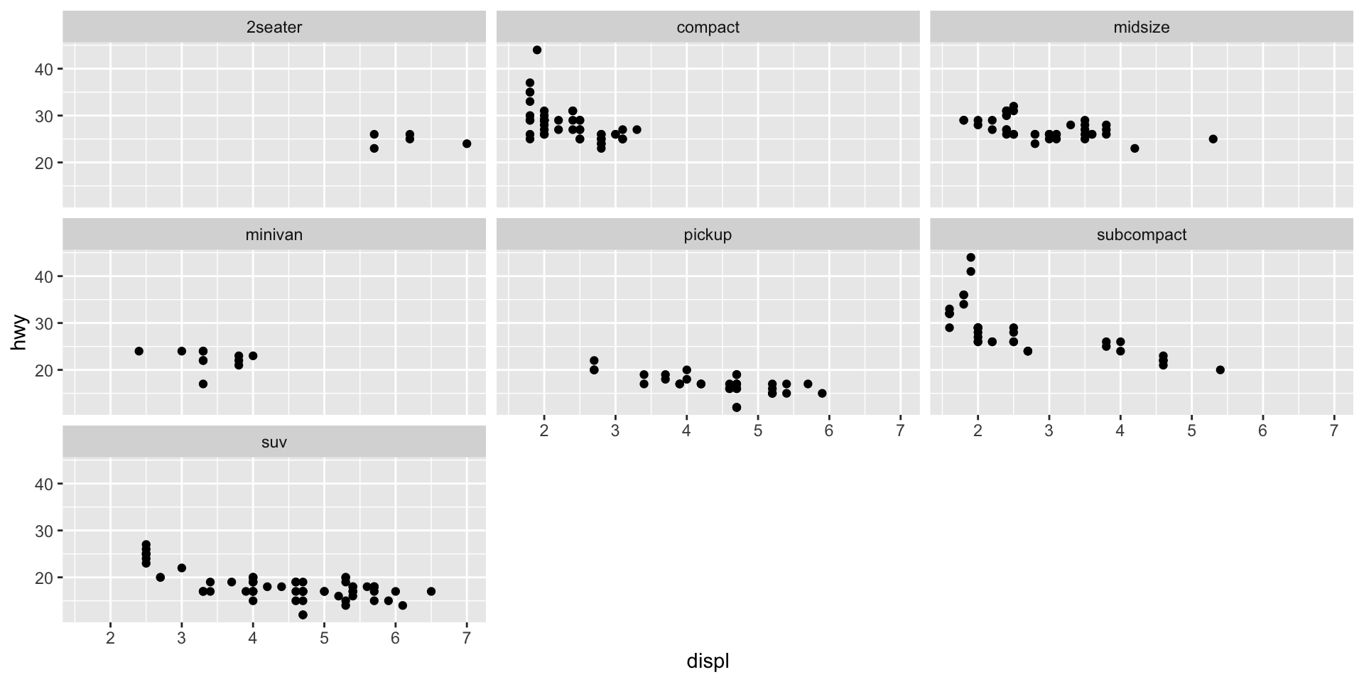
What are facets?
Facets split your plot into small multiples based on a variable.
What are facets?
Making it look good
Adding labels
Adding labels
Themes
Themes control the overall look:
Try different ones: theme_bw(), theme_classic(), theme_gray() (default)
Themes
Saving plots
Use ggsave() to save your plot:
Same template, psychology data
The ggplot template works the same way with any data:
set.seed(410)  # Reproducible results
# Simulated experiment: condition vs. anxiety score
psych_demo <- tibble(
  condition = rep(c("Control", "Treatment"), each = 30),
  anxiety = c(rnorm(30, mean = 35, sd = 8), rnorm(30, mean = 28, sd = 8))
)

ggplot(psych_demo, aes(x = condition, y = anxiety, fill = condition)) +
  geom_boxplot(alpha = 0.7, show.legend = FALSE) +
  labs(
    title = "Treatment Group Reports Lower Anxiety",
    x = NULL,
    y = "Anxiety score (BAI)"
  ) +
theme_minimal(base_size = 14)Same template, psychology data
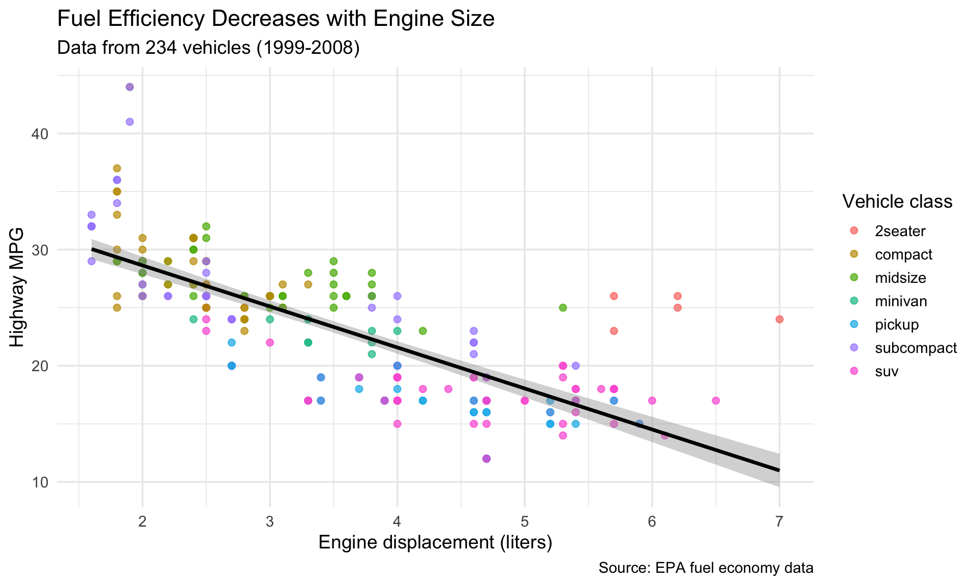
Putting it together
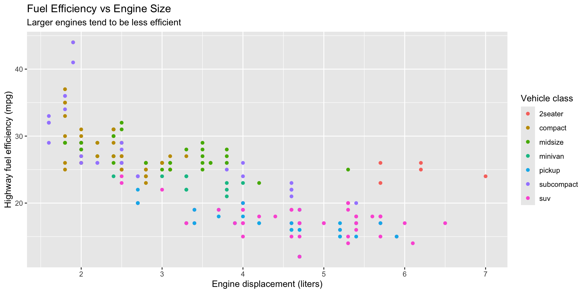
A complete example
ggplot(mpg, aes(x = displ, y = hwy)) +
  geom_point(aes(color = class), size = 2, alpha = 0.7) +
  geom_smooth(method = "lm", color = "black", se = TRUE) +
  labs(
    title = "Fuel Efficiency Decreases with Engine Size",
    subtitle = "Data from 234 vehicles (1999-2008)",
    x = "Engine displacement (liters)",
    y = "Highway MPG",
    color = "Vehicle class",
    caption = "Source: EPA fuel economy data"
  ) +
  theme_minimal(base_size = 14)
A complete example
Get a head start
Assignment 1 preview
Open a new R script in your project. Try these on your own:
- Make a scatterplot of
displvshwyfrommpg - Color it by
class - Facet by
drv(drive type) - Save it with
ggsave()
This is the first part of Assignment 1.
Solution
Wrapping up
Before next class
📖 Read: R4DS Ch 3: Data transformation (sections 3.1–3.4)
📝 Assignment 1 is due Sunday at 11:59 PM
Never trust a summary statistic you haven’t plotted
Today’s template — you’ll use it all quarter:
Next time: Data Transformation with dplyr
PSY 410 | Session 2